Appearance
Components
codecannon apps create a set of reusable components that can be used to build the frontend of your application. These components are designed to be used with Vue 3 and PrimeVue.
ModelSelect
ModelSelect is a component that allows the user to select a entity from a list of entities for a particular model. The list of models is fetched from the server.
The ModelSelect component is a wrapper around the PrimeVue Select commponent, so you can pass the Select props to the ModelSelect component.
vue
<template>
  <ModelSelect
      v-model="form.app_id"
      :api="new UsersApi()"
      option-label="name" />
</template>

<script>
import { ModelSelect } from '@/components'
import AppsApi from '@/models/Users/Api'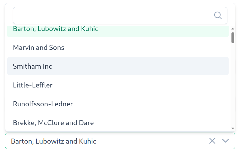
- See also
FormInput
FormInput is a form input wrapper commponent that allows you to easily add a label and error text to a form input. It also allows you to mark an input as required.
vue
<template>
  <FormInput
      label="Email"
      required
      :errors="formErrors.email">
      <InputText v-model="form.email" />
  </FormInput>

</template>

<script>
import FormInput from '@/components/FormInput.vue'
import InputText from 'primevue/inputtext'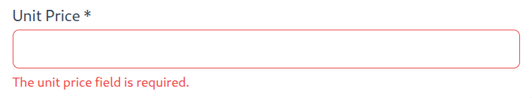
- See also
Container
Container is a wrapper component that allows you to add default sizing to your app views.
vue
<template>
	<div class="ui-container">
		<slot></slot>
	</div>
</template>

<style scoped lang="scss">
.ui-container {
	width: 100%;
	padding: 24px 10%;
}
</style>
When a Container is placed directly after another Container, the second one will automatically have its top padding removed to prevent double spacing.
Header
Header is a component that provides a standardized header bar for views. It displays a title, includes a mobile navigation menu button, and provides a slot for action buttons. The component is sticky and provides consistent styling across all views. It also includes an integrated loading indicator that can be controlled via the isLoading prop.
The Header component is a shared component located in @/components/Header.vue and is used in both List and Edit views.
Props
title(required,string): The title text to display in the header.isLoading(optional,boolean): Controls whether the integrated loading indicator is visible. Whentrue, a progress bar appears at the bottom of the header. Whenfalseorundefined, the loader is hidden. The loader includes a 100ms delay before appearing to prevent flicker for fast operations.
Features
Sticky Positioning: The header is positioned sticky at the top of the view, remaining visible when scrolling.
Mobile Menu Button: On screens smaller than 1500px, a hamburger menu button appears that opens the navigation overlay.
Slot for Actions: The component provides a default slot where you can place action buttons (like "Create" in list views).
Integrated Loading Indicator: The header includes a
HeaderLoadercomponent that displays a progress bar at the bottom of the header when loading operations are in progress. This is controlled via theisLoadingprop.Dark Mode Support: The header automatically adapts to dark mode preferences using CSS media queries.
Usage Example
vue
<template>
	<Header
		title="Edit Post"
		:is-loading="loaders.size > 0" />
	<Container class="edit">
		<Form
			:id="route.params.id as string"
			@start-loading="loaders.add('form')"
			@stop-loading="loaders.delete('form')" />
	</Container>
</template>

<script setup lang="ts">
import { reactive } from 'vue'
import { useRoute } from 'vue-router'
import Header from '@/components/Header.vue'
import Container from '@/components/Container.vue'
import Form from './components/Form.vue'

const route = useRoute()
const loaders = reactive(new Set<string>())
</script>ListSearch
ListSearch is a search input component designed for use with ListState instances. It provides a debounced search functionality that automatically queries the list state when the user types, with a clear button to reset the search.
The component integrates seamlessly with PrimeVue's IconField, InputIcon, and InputText components to provide a consistent search experience.
vue
<template>
	<Container>
		<ListSearch
			:list-state="listState"
			placeholder="Search Posts" />
	</Container>
	<Container>
		<ApiTable :list-state="listState">
			<!-- Table columns -->
		</ApiTable>
	</Container>
</template>

<script setup lang="ts">
import { onBeforeMount } from 'vue'
import Container from '@/components/Container.vue'
import ListSearch from '@/components/ListSearch.vue'
import useApiTable from '@/components/Table/useApiTable'
import { usePostListState } from '@/models/Post/States'

const listState = usePostListState()
const { ApiTable, Column } = useApiTable(listState)

onBeforeMount(() => {
	listState.getList()
})
</script>
Props
listState(required,ListState<any, any, any>): The list state instance to search. The component will calllistState.getList()with the search parameter when the user types.placeholder(optional,string): The placeholder text to display in the search input. Defaults to an empty string.
Features
Debounced Search: The search is debounced by 300ms, so the API is only called after the user stops typing for 300ms. This reduces unnecessary API calls.
Enter Key Support: Users can press Enter to immediately trigger the search without waiting for the debounce timer.
Clear Button: When there's text in the search input, a clear button (X icon) appears that allows users to quickly reset the search and return to the full list.
Automatic Pagination Reset: When searching, the component automatically resets to page 1, ensuring users see results from the beginning of the filtered list.
See also
HeaderLoader
HeaderLoader is a component that displays a loading indicator. It can be used on its own or as the integrated Header component loader.
The component has a height of 2px and a negative bottom margin of -2px, allowing it to seamlessly integrate with headers without adding extra spacing.
The loader includes a 100ms delay before appearing, so fast requests (completing in less than 100ms) won't trigger the loader. This prevents unnecessary visual flicker for quick operations. Once loading stops, the loader hides immediately with no delay.
Props
isLoading(optional,boolean): Controls whether the loader is visible. Whentrue, the loader is displayed. Whenfalseorundefined, the loader is hidden.See also
FormContainer
The FormContainer component is a wrapper component that adds forms the ability to be rendered either as a card or as a dialog.
vue
<template>
	<Dialog
		v-if="asDialog"
		:visible="visible"
		modal
		class="form-container"
		:header="title"
		@update:visible="emit('close')">
		<slot />
	</Dialog>
	<Card
		v-else
		border
		class="form-container">
		<template #title>
			{{ title }}
		</template>
		<template #content>
			<slot />
		</template>
	</Card>
</template>

<script setup lang="ts">
import Card from 'primevue/card'
import Dialog from 'primevue/dialog'

const emit = defineEmits<{
	(e: 'close'): void
}>()

withDefaults(
	defineProps<{
		asDialog?: boolean
		visible?: boolean
		title: string
	}>(),
	{
		asDialog: false,
		visible: false,
	},
)
</script>

<style lang="scss">
.form-container {
	width: 100%;
	max-width: 600px;
}
</style>
Usage as dialog
The FormContainer component can be used as a dialog by setting the asDialog prop to true. The dialog will be displayed when the visible prop is set to true.
vue
<template>
    <FormContainer
        asDialog
        :visible="visible"
        title="Create User"
        @update:visible="visible = $event">
        <!-- Form content -->
    </FormContainer>
</template>

<script setup lang="ts">
import { ref } from 'vue'
import FormContainer from '@/components/FormContainer.vue'

const visible = ref(false)
</script>
By changing the visible prop, you can control the visibility of the dialog.
You can listen to the visible status of the FormContainer component by listening to the update:visible event.
Usage as card
The FormContainer component can be used as a card by setting the asDialog prop to false. The card will be displayed with the title provided.
vue
<template>
    <FormContainer
        title="Create user">
        <!-- Form content -->
    </FormContainer>
</template>
ApiTable
The ApiTable component is designed for displaying paginated API data. It leverages PrimeVue components (such as DataTable, Paginator, and Card) to render a fully functional table with pagination support. By providing a listState instance, the component can manage data fetching, loading states, and pagination interactions automatically.
Important: For proper TypeScript type inference in Column slot props, always use the
useApiTablecomposable to import table components instead of importing them directly. This ensures thatcolumnProps.datais properly typed in your templates.
vue
<template>
	<ApiTable
		:list-state="listState">
		<Column
			field="title"
			header="Title" />
		<Column
			field="body"
			header="Body" />
	</ApiTable>
</template>

<script setup lang="ts">
import { onBeforeMount } from 'vue'
import useApiTable from '@/components/Table/useApiTable'
import { usePostListState } from '@/models/Post/States'

const listState = usePostListState()
const { ApiTable, Column } = useApiTable(listState)

onBeforeMount(() => {
	listState.getList()
})
</script>
The example above is how the table is used in List views. The ApiTable component is used to display a list of posts. The Column component is used to define the columns of the table. The ApiTableLinkButton and ApiTableRemoveButton components are used to add action buttons to table rows.
- See also
- API -
useApiTable- For type-safe table components
- API -
Table data
The ApiTable component requires a listState prop to be passed in. The listState prop is an instance of the ListState class. It allows the ApiTable component to manage data fetching, loading states, and pagination interactions.
The data is not automatically loaded on mount, so you have to call the getList method on the listState instance to fetch the data. This is so you can control when the data is fetched.
Since the API table works with ListState, all requests will be made with the default parameters or saved queries on the ListState instance.
- See also
Pagination
The ApiTable component uses the Paginator component from PrimeVue to handle pagination. The Paginator component is automatically rendered at the bottom of the table. The ApiTable automatically handles pagintation state using the ListState instance provided.
Loading Indicator
The ApiTable component automatically displays a loading indicator when data is being fetched. The loading indicator uses the HeaderLoader component and is positioned directly under the table header row.
The loading state is determined by:
The
loadingprop, if explicitly provided (defaults toundefined)Otherwise, the
listState.isLoading.valuefrom theListStateinstanceSee also
- Frontend -
HeaderLoader- The loading indicator component - Frontend -
ListState- State management and loading for tables
- Frontend -
Row click
The ApiTable component emits a row-click event when a row is clicked. The event is emitted with the row data as the payload. This allows you to handle click events on rows in the table.
vue
<template>
	<ApiTable
		:list-state="listState"
		@row-click="openDetails">
		<Column
			field="title"
			header="Title" />
		<Column
			field="body"
			header="Body" />
	</ApiTable>
</template>

<script setup lang="ts">
import { useRouter } from 'vue-router'
import useApiTable from '@/components/Table/useApiTable'
import { usePostListState } from '@/models/Post/States'
import type { Post } from '@/models/Post/Model'

const listState = usePostListState()
const router = useRouter()
const { ApiTable, Column } = useApiTable(listState)

function openDetails(item: { data: Post }) {
	router.push({ name: 'posts-edit', params: { id: item.data.id } })
}
</script>
Selection
The ApiTable component supports row selection. You can enable row selection by setting the selectionMode prop to 'single' or 'multiple'. The selected rows are stored in the selected prop as a reactive set.
You can pass a selected prop to the ApiTable component to control the selected rows from the parent component.
vue
<template>
    <ApiTable
        :list-state="listState"
        :selected="selected"
        selection-mode="multiple">
        <Column
            field="title"
            header="Title" />
        <Column
            field="body"
            header="Body" />
    </ApiTable>
</template>

<script setup lang="ts">
import { ref } from 'vue'
import useApiTable from '@/components/Table/useApiTable'
import { usePostListState } from '@/models/Post/States'
import type { Post } from '@/models/Post/Model'

const listState = usePostListState()
const { ApiTable, Column } = useApiTable(listState)
const selected = ref<Set<Post>>(new Set())
</script>
Loading
The ApiTable component automatically handles loading states. The loading prop can be used to override the loading state of the table should you need it.
If the loading prop is set to true, the table will display a loading indicator.
If the listState loading state is set to true, the table will display a loading indicator regardless of the loading prop.
vue
<template>
    <ApiTable
        :list-state="listState"
        :loading="loading">
        <Column
            field="title"
            header="Title" />
        <Column
            field="body"
            header="Body" />
    </ApiTable>
</template>

<script setup lang="ts">
import { ref } from 'vue'
import useApiTable from '@/components/Table/useApiTable'
import { usePostListState } from '@/models/Post/States'

const listState = usePostListState()
const { ApiTable, Column } = useApiTable(listState)
const loading = ref(false)
</script>
ApiTableRemoveButton
The ApiTableRemoveButton component is a button that allows you to remove a row from the table. The component is designed to be used inside the ApiTable component.
vue
<template>
	<ApiTable
		:list-state="listState">
		<Column
			field="title"
			header="Title" />
		<Column
			field="body"
			header="Body" />
		<Column header="">
			<template #body="slotProps">
				<ApiTableRemoveButton :item="slotProps.data" />
			</template>
		</Column>
	</ApiTable>
</template>

<script setup lang="ts">
import { onBeforeMount } from 'vue'
import useApiTable from '@/components/Table/useApiTable'
import { usePostListState } from '@/models/Post/States'

const listState = usePostListState()
const { ApiTable, Column, ApiTableRemoveButton } = useApiTable(listState)

onBeforeMount(() => {
	listState.getList()
})
</script>
The ApiTableRemoveButton component requires an item prop to be passed in. The item prop is the entity that the button will remove via the API.
The user will be prompted with a confirmation dialog before the item is removed.
- See also
ApiTableLinkButton
The ApiTableLinkButton component is a button that creates a link to navigate to another page. The component is designed to be used inside the ApiTable component to add edit or view links to table rows.
vue
<template>
	<ApiTable
		:list-state="listState">
		<Column
			field="title"
			header="Title" />
		<Column
			field="body"
			header="Body" />
		<Column
			:style="{ maxWidth: '112px', width: '112px' }"
			header="">
			<template #body="columnProps">
				<ApiTableLinkButton
					:to="{ name: 'posts-edit', params: { id: columnProps.data.id } }"
					icon="fal fa-pen-to-square" />
			</template>
		</Column>
	</ApiTable>
</template>

<script setup lang="ts">
import { onBeforeMount } from 'vue'
import useApiTable from '@/components/Table/useApiTable'
import { usePostListState } from '@/models/Post/States'

const listState = usePostListState()
const { ApiTable, Column, ApiTableLinkButton } = useApiTable(listState)

onBeforeMount(() => {
	listState.getList()
})
</script>
The ApiTableLinkButton component requires two props:
to: The route destination (same type as Vue Router'sRouterLinktoprop)icon: The icon class name to display (e.g., Font Awesome icon classes)
The component renders as a circular button with the specified icon, and clicking it navigates to the specified route.
- See also
FontAwesomeIcon
FontAwesomeIcon is a custom reactive icon component for displaying Font Awesome icons. This component is required because the application uses a vendored Font Awesome Pro all.min.js bundle rather than the official Vue FontAwesome packages.
Why a Custom Component?
The official @fortawesome/vue-fontawesome package depends on @fortawesome/fontawesome-svg-core, which is difficult to vendor. Since we use a vendored all.min.js bundle (which includes all Font Awesome Pro icons), we need a custom component to support reactive icon changes.
Usage
vue
<template>
	<FontAwesomeIcon icon="fal fa-rocket" />
	<FontAwesomeIcon :icon="dynamicIcon" />
</template>

<script setup lang="ts">
import FontAwesomeIcon from '@/components/FontAwesomeIcon.vue'
import { ref } from 'vue'

const dynamicIcon = ref('fal fa-rocket')
</script>
Props
icon(required,string): The Font Awesome icon class string (e.g.,"fal fa-rocket","fas fa-check").
Replacing with Official Font Awesome Packages
If you prefer to use the official @fortawesome/vue-fontawesome package instead of the vendored all.min.js bundle, follow these steps:
Install the required packages:
bashnpm install @fortawesome/fontawesome-svg-core @fortawesome/vue-fontawesome npm install @fortawesome/pro-light-svg-icons @fortawesome/pro-regular-svg-icons # Install other icon packages as neededRemove the vendored all.min.js import from
main.ts:ts// Remove this line: import '@/assets/fontawesome-pro/all.min.js'Configure the library in
main.ts:tsimport { library } from '@fortawesome/fontawesome-svg-core' import { faRocket, faPlus, faCheck } from '@fortawesome/pro-light-svg-icons' library.add(faRocket, faPlus, faCheck)Replace the component import:
ts// Change from: import FontAwesomeIcon from '@/components/FontAwesomeIcon.vue' // To: import { FontAwesomeIcon } from '@fortawesome/vue-fontawesome'
TIP
The vendored all.min.js approach loads all Font Awesome Pro icons at once, which is simpler but results in a larger bundle. The official package approach requires explicit imports but enables tree-shaking for smaller bundles.